LKShopper
About
Perwi Group is a leading plastic product manufacturer in Sri Lanka that optimizes resources and introduces the latest technology to produce high-quality plastic products. The company is well equipped with modern workshop facilities covering an area of 4000 square feet and designs and develops compression molds, transfer molds, and extrusion dies for rubber products using its in-house workshop. They also have a Plastic Injection Molding Workshop located in Panadura, Sri Lanka. Perwi Group offers flexible solutions, high quality, timely delivery, and precise molding.
Project Overview
Recently they have started a range of household plastic items which suits the day-to-day life of people living in Sri Lanka. The company wants to take these products to people through internet. They need an ecommerce website for this task.
Project Duration
6 Months
Our Role
Tools
Photoshop Adobe XD WordPress WooCommerce Figma
Goals
- Sell products online
- Promote products to the audience
Business Goals
- Provide customers with more easy ways to buy products
- Make the community aware of products and increase business
- Increase company reputation and brand value
- Increase product sales
- Reduce excess production through following an online order level
User Goals
- Search and order plastic products at the ease of home
- Effective delivery of goods
- Ease of ordering
- Choose from a wide variation of a single item (color, size)
Project Goals
- Create a system to align business goals with user goals
- Increase sales of the business
- Improving ways to order products
- Define methods to market products online
Process
Design Process (UX Design)
Empathize
Define
The basic requirement was to list their products in a website and display them over the internet. The company wants to implement
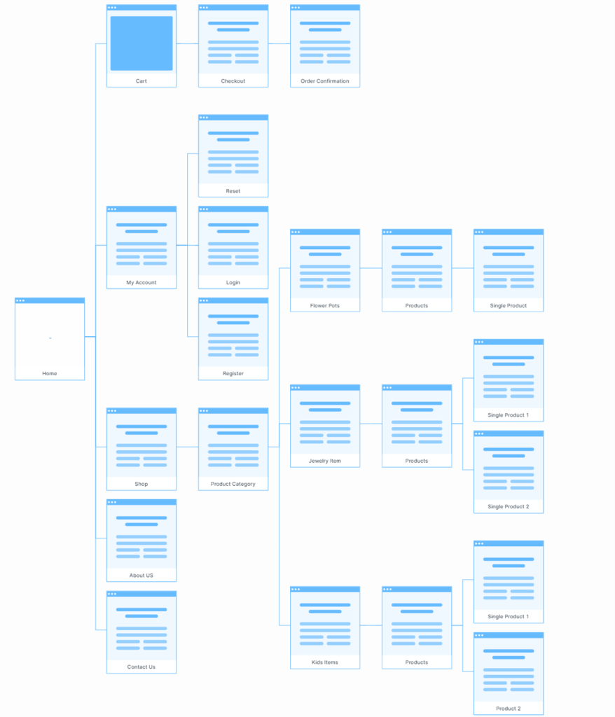
In the user’s side, they should be able to view products and select any products they wish to order. Each product they wish to order will be added to a cart in the desired quantity and checkout. The total of the order will be paid through a payment gateway. The user will enter their delivery address during checkout. The company gets the order in control panel. They view the payment status, get the delivery address, then deliver the product via courier.
Ideate
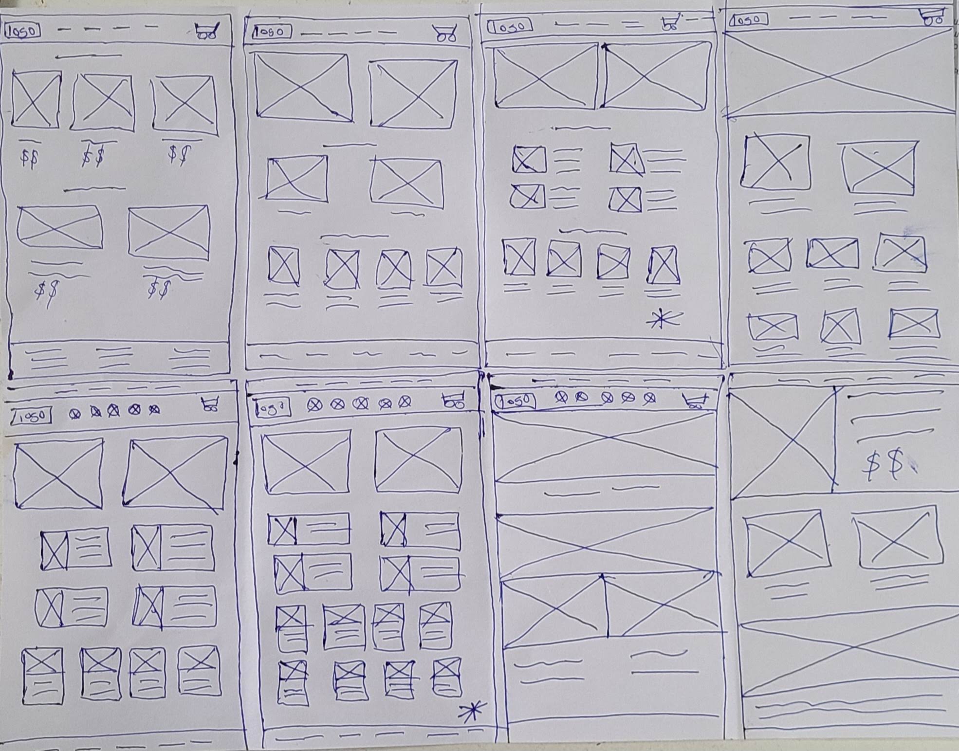
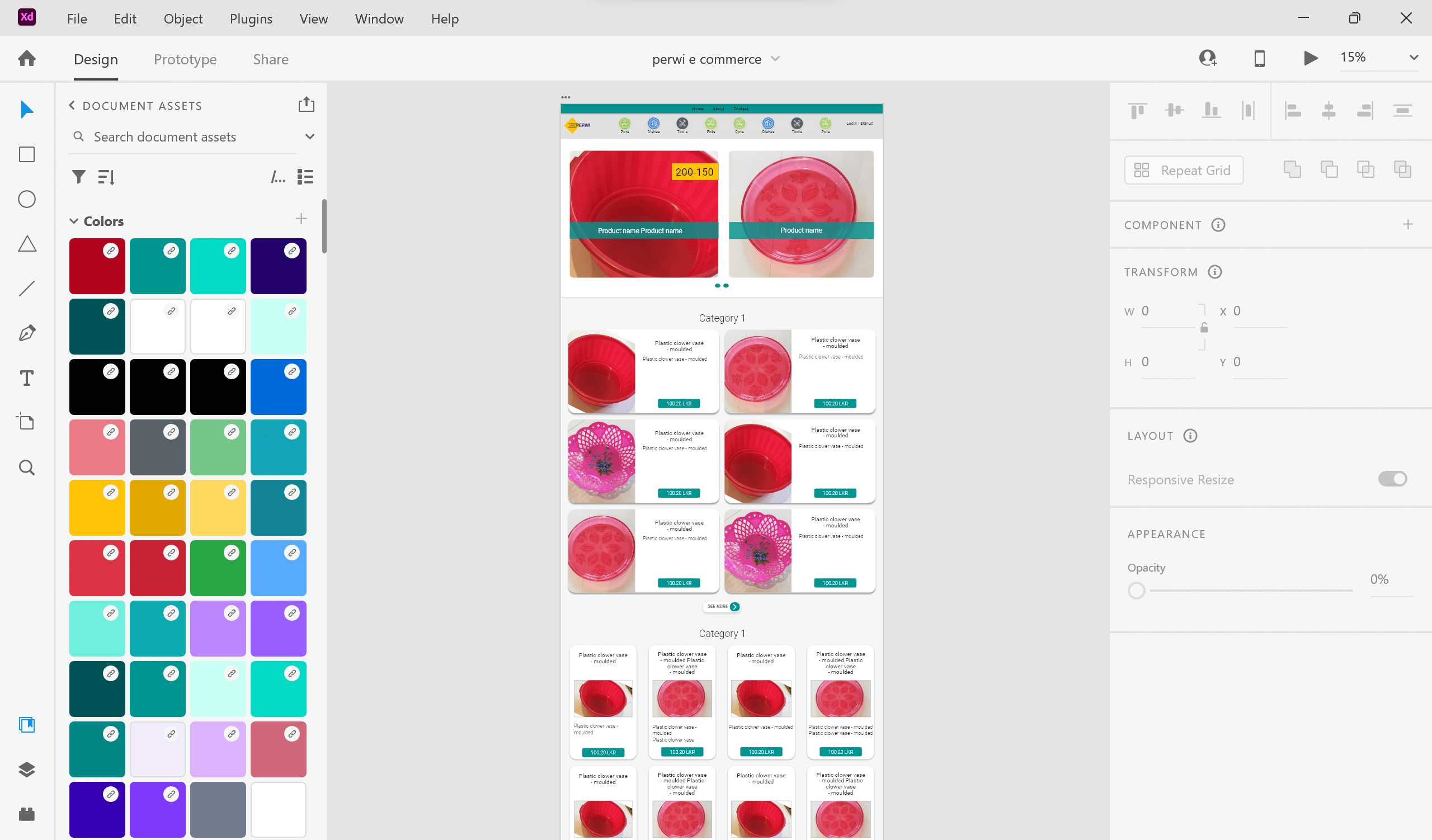
The Crazy 8 method was used to create paper drawings of wireframes and selected the best suitable wireframe to the system. Then used Adobe XD and Figma to convert the wireframes into digital wireframes. First the low fidelity wireframes were created. Then high-fidelity wireframes were created as mockups.
Prototypes
Test
The prototypes were tested by selecting 2 participants from the manufacturer’s employees, to test the usability of administration panel. 5 participants were chosen voluntarily as the users who place orders for products.
Few pain points were identified during this testing.
| Pain Points | Solution |
| No search bar to search products | Include search bar |
| Had to click on products and view products to add to cart. Consumes time | Added “add to cart” icon when mouse over to add products directly from home page to cart |
| Couldn’t mark products as favorites | Favorite icon added to function as add to favorite function |
| Had to browse to the bottom through category sections one by one to view all categories | Added category menu to top. So the users can click on each category directly to view category pages |
Development process (System Design)
- Develop (convert designs and prototypes into the web system) –
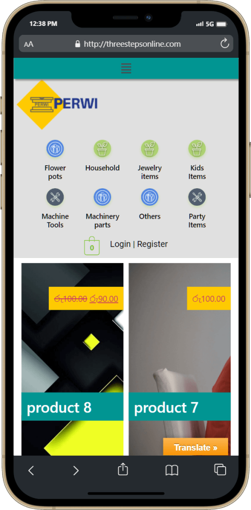
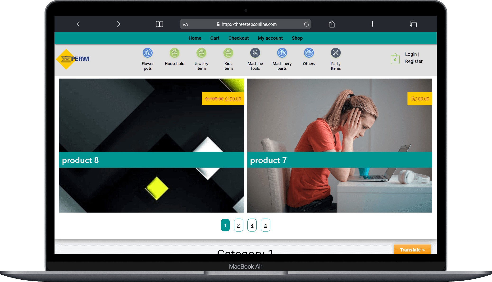
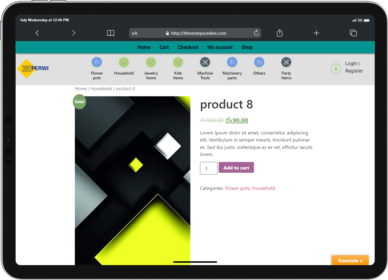
Conversion of mockups to web pages were done with special attention given to responsiveness. Prototype functions were implemented through web code. E commerce Frameworks with common e commerce functions were used to achieve rapid development goals. Initially a payment gateway was setup as a sandbox environment for testing purposes - Testing –
Testing was carried out with focus on e commerce functions such as order placing, invoice generation, emailing invoices. Admin functions such as stock entry, product variations, price updating were focused. Mobile responsiveness was tested on various devices. Payment gateway was tested using a test version which is identified as a sandbox environment. After testing the real payment gateway account was setup and tested using real credit cards. - Implementation –
Website was implemented on the web server. The domain name ceylonmarket.store was pointed to the server.
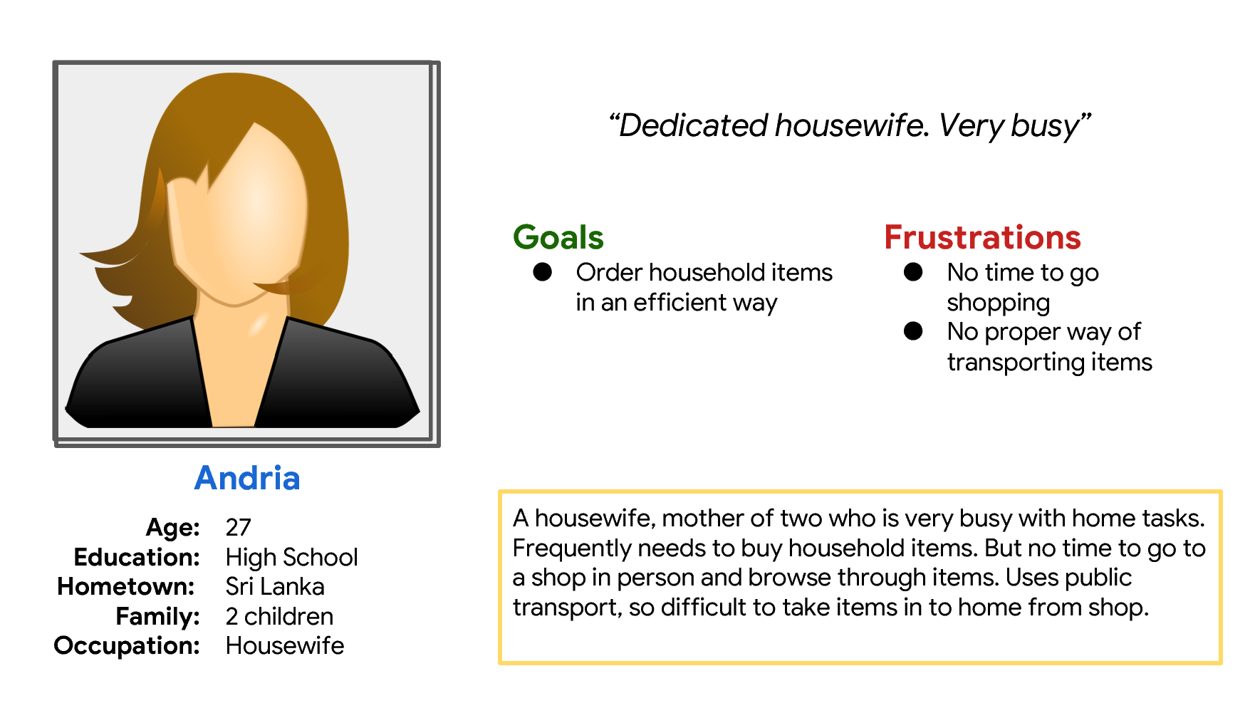
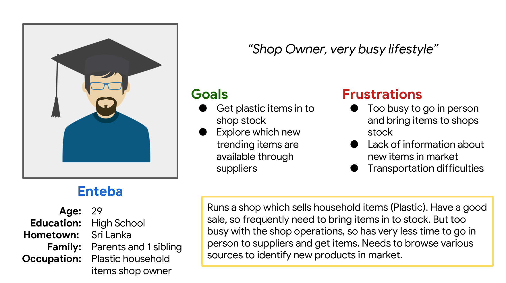
Personas
Information Architecture
